Visualizing GitHub workflow run length time
Published 2024-03-03 on Farid Zakaria's Blog
GitHub Actions have now become an integral part of many open source projects, providing a free & powerful CI system. I am surprised however there is no provided way to visualize the run length time (or other meaningful metrics) of your actions.
🕵️ I did find a few other third-party solutions that either extract the data or themselves can be added as a step to your workflow to get similar visualizations. I wanted something simpler.
I previously wrote a post about the cost of runfiles which had become evident when we noticed our GitHub Bazel build workflow had slowed down by 50x.
After landing my fix, I wanted to visualize the run length time of the action; and objectively see if my fix had worked. Trust but verify.
I found the GitHub API does provide the run time length of each workflow. The GitHub CLI makes it easy to extract out the data as JSON.
The following command generates the 100 last runs of the buildAndTestBazel.yml workflow for the openxla/stablehlo repository. It then filters the data to only include the startedAt and updatedAt fields and saves it to a file called json_data.json.
$ gh run list --workflow buildAndTestBazel.yml \
              --repo openxla/stablehlo \
              --json startedAt,updatedAt \
              --status completed \
              --branch main \
              --limit 100 > json_data.json
This JSON file then served as the foundation for the next phase: visualization. Enter plotnine, a Python plotting library that brings the declarative and powerful grammar of graphics (the philosophy behind ggplot2 in R) to the Python ecosystem. Plotnine enables creating complex plots from data in a DataFrame with minimal fuss, making it an ideal choice for our purpose.
🕵️ For those unfamiliar, ggplot (and by extension, plotnine) is predicated on the idea of building plots layer by layer, adding components such as scales, axes, and geometries incrementally. This approach not only makes the plot construction intuitive but also highly customizable. I really like using them graphing because it means I can commit reusable, reliable and reproducible code for generating my visualizations.
Using another script, I transformed the JSON data into a Pandas DataFrame and then into time series graphs using plotnine. The final visualization was used to prove that my fix had worked and that the run length time had indeed decreased.
You can view the script at this gist - b3ca5a1d3700714497925d026bd8105b
import pandas as pd
from plotnine import ggplot, aes, geom_line, theme, labs, scale_x_datetime, element_text, geom_point
import json
from datetime import datetime

#  $ gh run list --workflow buildAndTestBazel.yml --repo openxla/stablehlo --json startedAt,updatedAt --status completed --branch main --limit 100 > json_data.json
# Assuming `json_data` is your JSON data loaded into a variable
# If your JSON is in a file, you can load it with:
with open('json_data.json', 'r') as f:
    json_data = json.load(f)

# Convert JSON data to DataFrame
df = pd.DataFrame(json_data)

# Convert the startedAt and updatedAt columns to datetime
df['startedAt'] = pd.to_datetime(df['startedAt'])
df['updatedAt'] = pd.to_datetime(df['updatedAt'])

# Calculate the elapsed time in seconds
df['elapsedTime'] = (df['updatedAt'] - df['startedAt']).dt.total_seconds()

# If your datetimes are in UTC, ensure the comparison Timestamp is also in UTC
now = pd.Timestamp.utcnow()
one_month_ago = now - pd.DateOffset(months=1)

# Filter data to the last month, ensuring both datetimes are timezone-aware or both are naive
df_last_month = df[df['startedAt'].dt.tz_localize(None) >= one_month_ago.tz_localize(None)]

# Plot using plotnine
plot = (ggplot(df_last_month, aes('startedAt', 'elapsedTime')) +
        geom_line() +
        theme(axis_text_x=element_text(rotation=90, hjust=1)) +
        labs(x='Date Workflow Started', y='Elapsed Time (seconds)', title='Elapsed Time Series') +
        scale_x_datetime(date_breaks='1 day', date_labels='%Y-%m-%d')) + geom_point()

# Display or save the plot
# To display the plot in a Jupyter notebook or similar environment, just use:
plot.show()

# To save the plot to a file, use:
plot.save("elapsed_time_series.png", width=4, height=4, dpi=150)
😲 ChatGPT & Gemini were both pretty good options at generating the code necessary to generate the graphs. Declarative language for tasks proves to be a powerful use for LLMs.
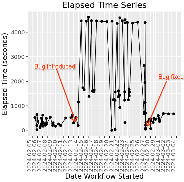
The visualized graph may not be the prettiest but it gets the job done and is reproducible for the dataset.
If you have suggestions on how to improve the visualization or the process, please let me know. Hopefully GitHub will provide a built-in way to visualize this data in the future. 🤞
Improve this page @ 4f0476f
The content for this site is
CC-BY-SA.